Magazine and Book Design
Publication design • Print production • Digital publishing
A good publication doesn’t just hold information – it holds attention. I design printed and digital publications that turn content into an experience – the kind people linger over, flick back through, and return to again.
Through playful layouts, expressive typography and a strong sense of rhythm, I help guide readers effortlessly from page to page – making even complex content feel clear, engaging and enjoyable.
From books, magazines and journals to brochures, newsletters and reports, I design and produce thoughtful, beautifully balanced publications – supported by a full printing service and digital publishing for platforms such as Amazon KDP.
The Common Space and Isle of Wight Council
BRANDING AND VISUAL IDENTITY • 4 BOOK PUBLICATIONS • SQUARE LEAFLET • BANNERS • GRAPHIC DESIGN • ILLUSTRATION • PRINT
**Shortlisted for the Isle of Wight Chamber Business Awards - Creative Impact Award 2026. Winner will be announced 11th September. Absolutely thrilled!!
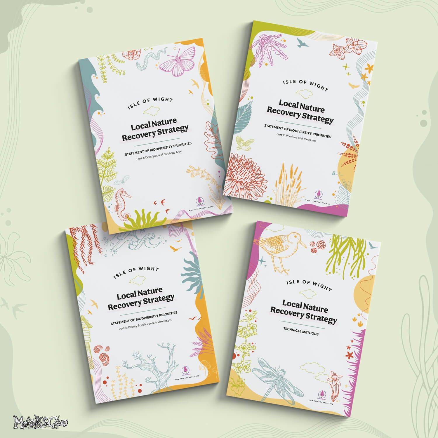
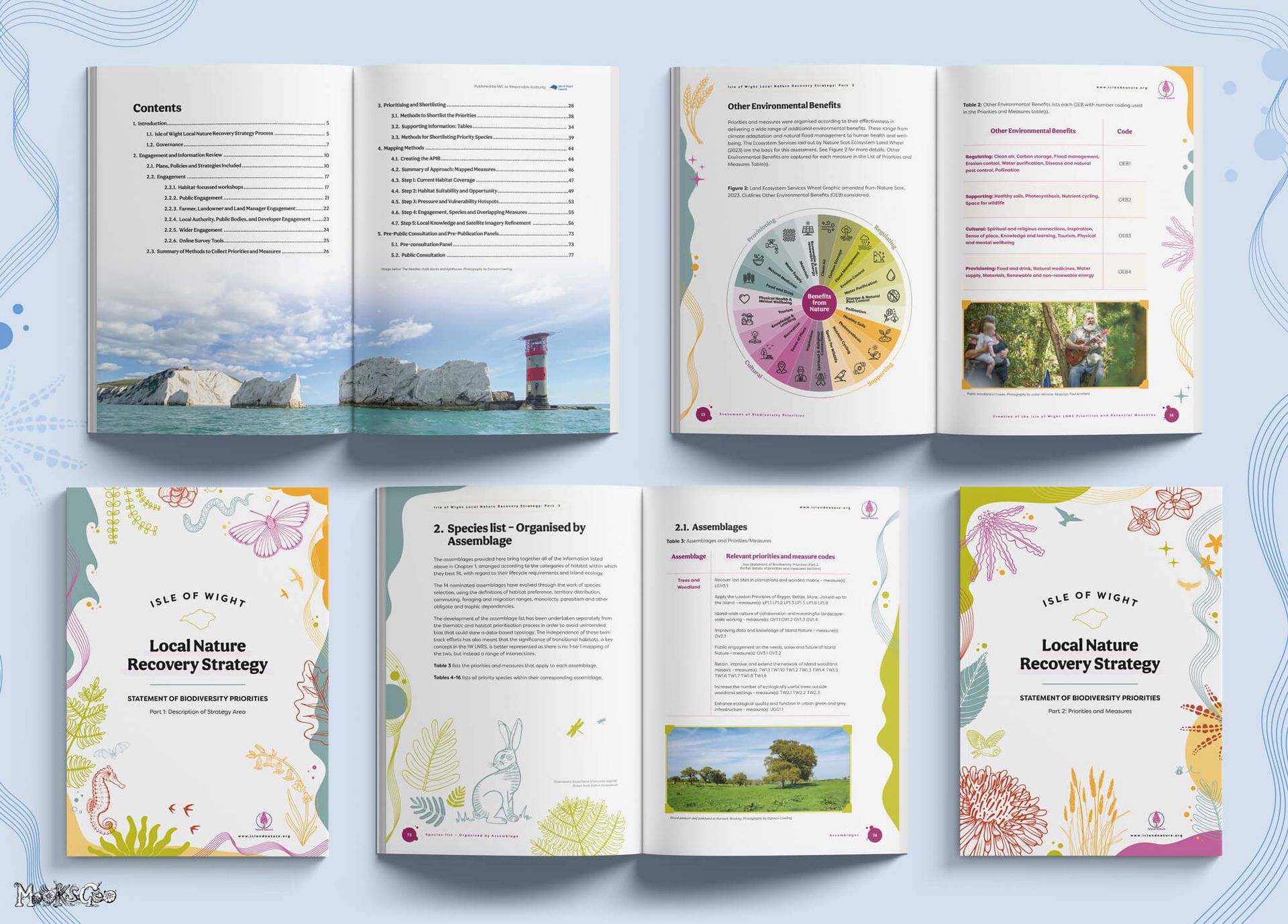
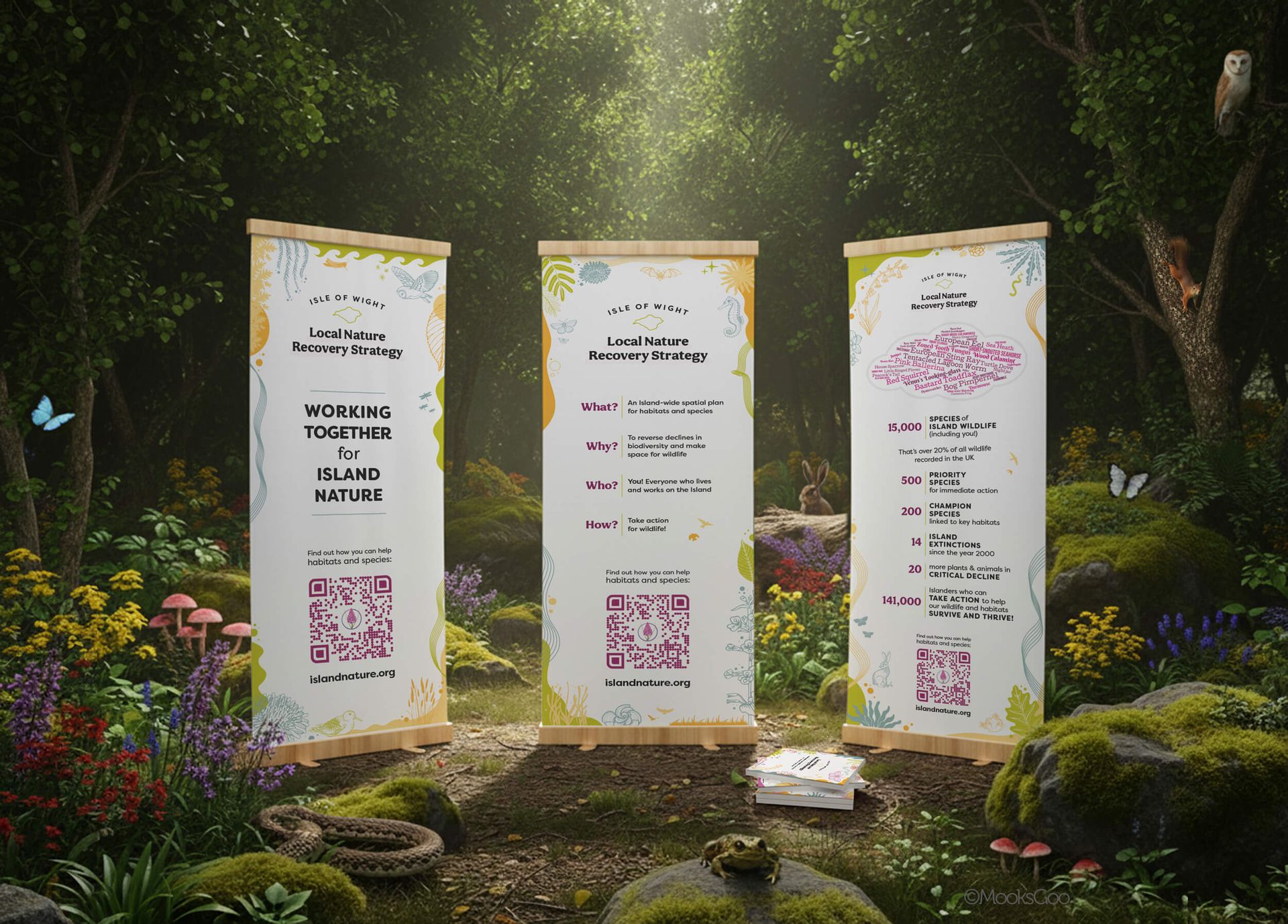
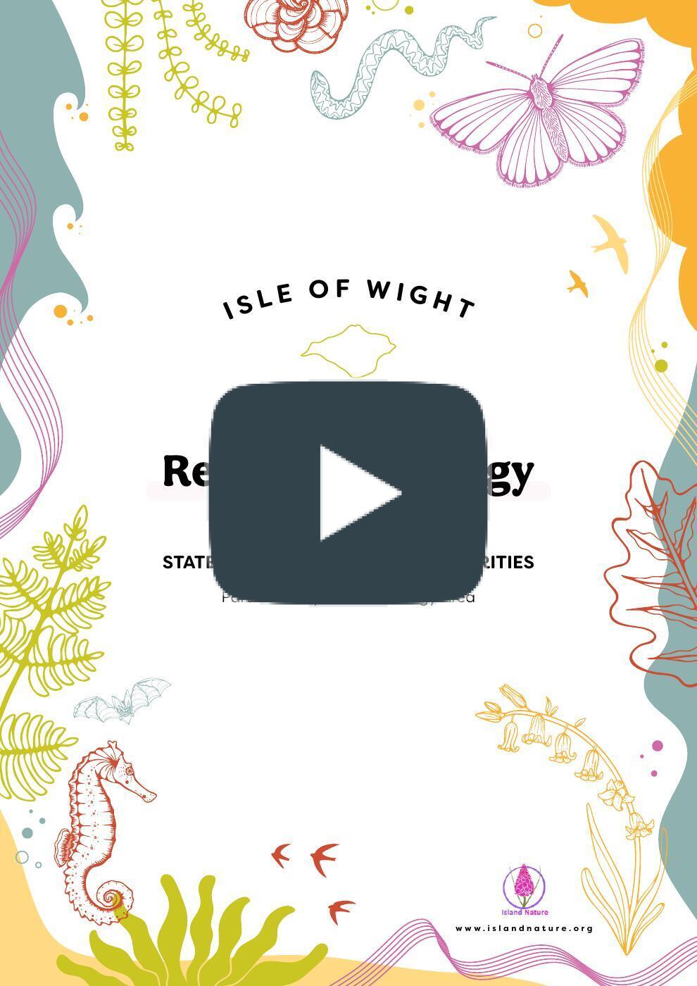
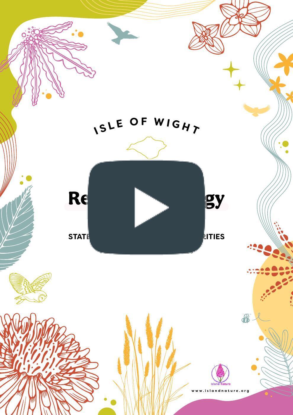
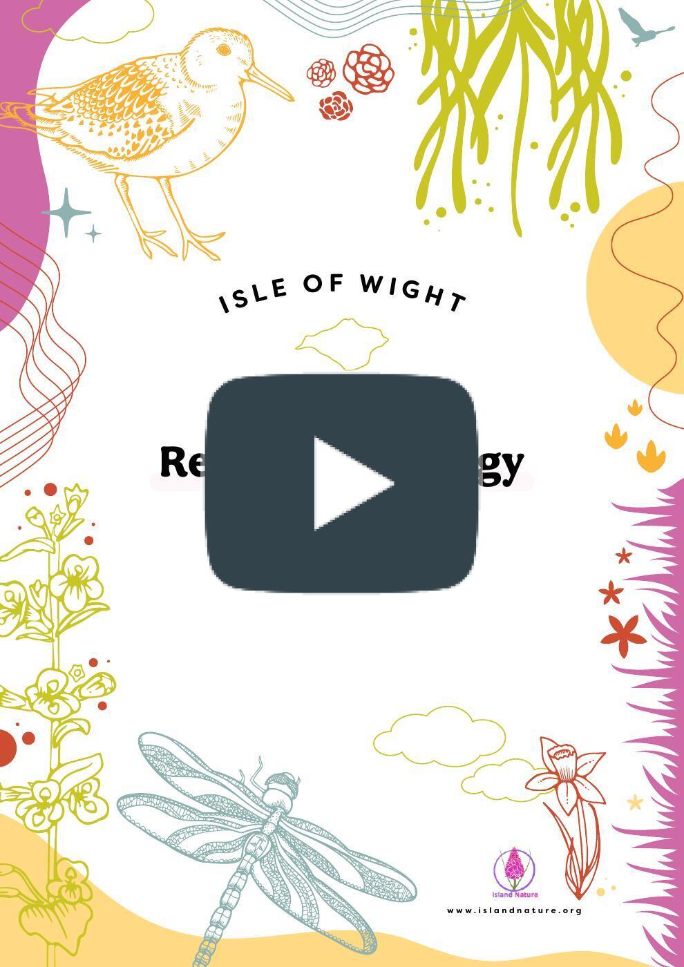
Island Nature (part of The Common Space) were commissioned to produce the Isle of Wight’s Local Nature Recovery Strategy (LNRS) on behalf of the Isle of Wight Council – one of the first LNRSs in England, and the first within a UNESCO Biosphere Reserve.
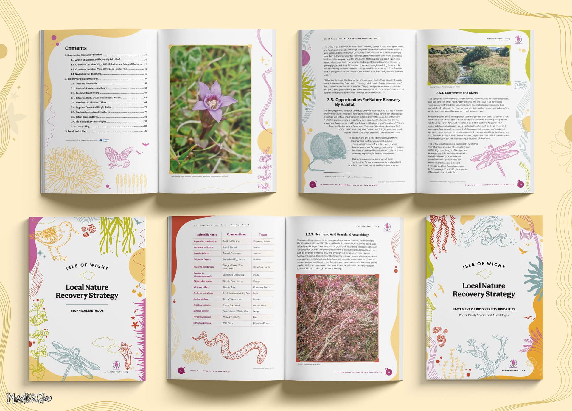
My role was to design, illustrate, and fully produce and print the entire suite of LNRS publications – transforming a huge, technical strategy into a cohesive set of accessible, engaging books for public release.
So what is a Local Nature Recovery Strategy?
In short, it’s a mapped plan for protecting, restoring, and improving nature in a specific area, showing where action is most needed and how people can help.
After two years of research, engagement and gathering dense ecological data, one of the key challenges was turning government-guidelined strategic documents into something accessible, engaging, and easy for people to navigate.
"Having worked with MooksGoo across many campaigns, The Common Space trusted Michelle to bring this huge project to life. The LNRS involved acres of text, species lists, technical method tables, the story of the whole Island, toolkits, a website, and banners – all needing a clear visual identity. Thanks to Michelle’s design and illustration, the entire body of work came together beautifully, with brilliant designs and clear, colourful illustrations that highlight the Island’s most at-risk and often unsung species, from Apple moss to the Water vole."
The Isle of Wight LNRS launched in May 2025 with UK Government approval and recognition as a national exemplar and blueprint for England - something which I'm so very proud of! It continues to receive praise for its clarity, creativity, and engaging approach to nature recovery storytelling.
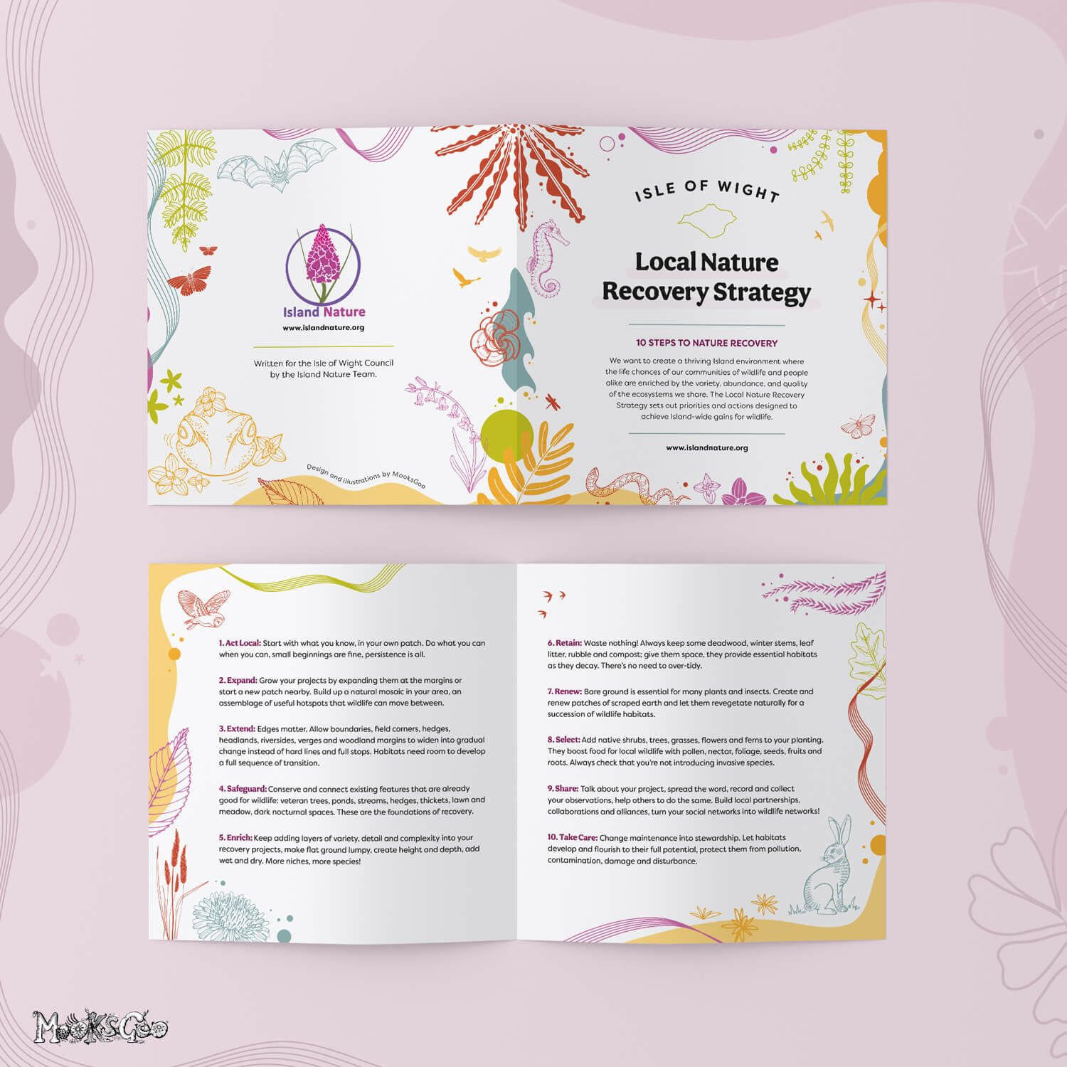
The artwork draws inspiration from the Island’s diverse habitats and species, using hand-drawn botanical elements, soft organic shapes, and playful environmental details that invite closer inspection. Subtle textures, bright but balanced colours, and fluid lines create a sense of movement and life throughout the layouts, mirroring the energy and diversity of the Island’s wildlife.
This visual identity centres on a “the more you look, the more you see” experience, with hidden creatures, habitat motifs, and gentle storytelling touches woven throughout. These details not only celebrate the Isle of Wight’s biodiversity, but also help viewers build a deep emotional connection with the subject matter.
The overall style is cohesive, friendly, and modern, with a strong focus on accessibility: clear hierarchy, simple icons, intuitive spacing, and typography that guides the reader through scientific concepts with ease. The result is a set of publications and public-facing materials that feel informative yet magical; professional yet playful - transforming important conservation data into something people genuinely enjoy exploring.
You can view these books at most Isle of Wight libraries, or they are available to view digitally on my website below. They're also on Island Nature's website or the Isle of Wight Council's website.
This was an absolute dream project - design meets conservation in a way that supports our wild Island.
"This was a massive challenge… but thanks to Michelle’s creativity it all came together brilliantly. Her enthusiasm, commitment and positive approach to problem-solving, along with extraordinary patience and professionalism are second to none – in short, we recommend you work with her always!"
Claire Hector, The Common Space
IOW LNRS Part 1: Description of Strategy Areas
IOW LNRS Part 2: Priorities and Measures

IOW LNRS Part 3: Priorities and Assemblages
IOW LNRS: Technical Methods

IOW LNRS 10 Steps to Nature Recovery leaflet

The Local Directory
MAGAZINE DESIGN • BROCHURE LAYOUT • GRAPHIC DESIGN • PRINTING
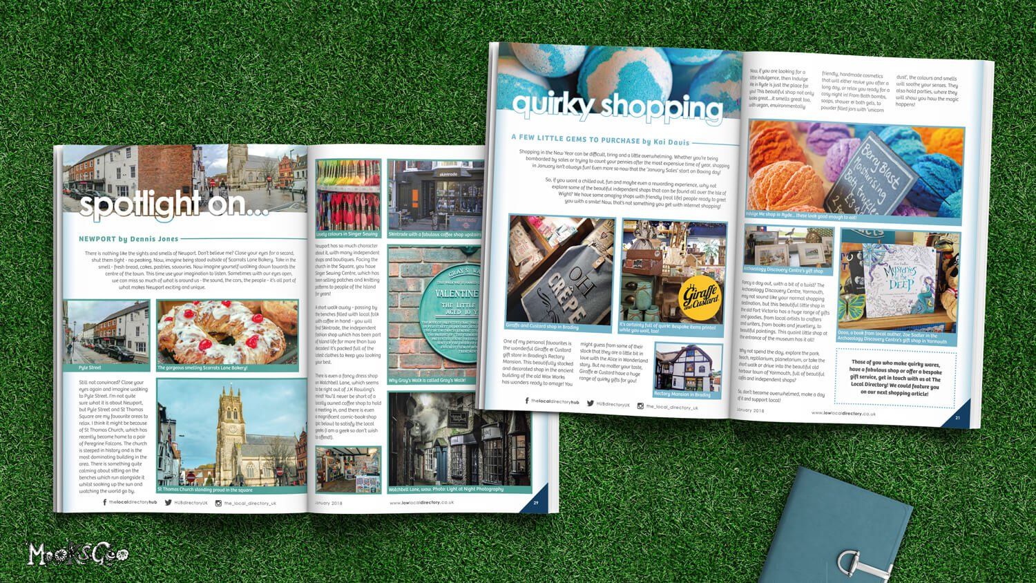
The Local Directory was a free magazine to the Isle of Wight community. It was full to the brim of fun articles, history about the Island, tips and tricks, and helped local business get noticed. Being the lead creative, I was responsible for the overall design layout, the continuous re-design for the monthly publication, as well as print set up and production.
"Michelle is one of the best designers we've ever worked with. She's a highly efficient and very talented designer!"
The Local Directory

Liz Earle
MAGAZINE DESIGN • BROCHURE LAYOUT • GRAPHIC DESIGN
I was invited by the reputable beauty brand, Liz Earle, to create an internal 'essential retail magazine' for their work team. Adhering to their branding guide ensured consistency throughout.
"Thank you Michelle, it is all excellent. You've captured our branding and executed the design perfectly!"
Liz Earle


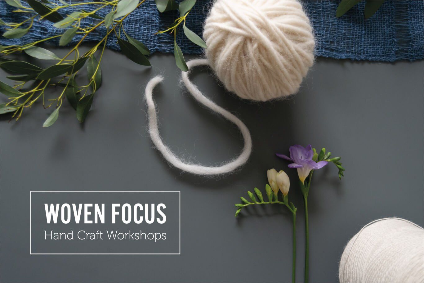

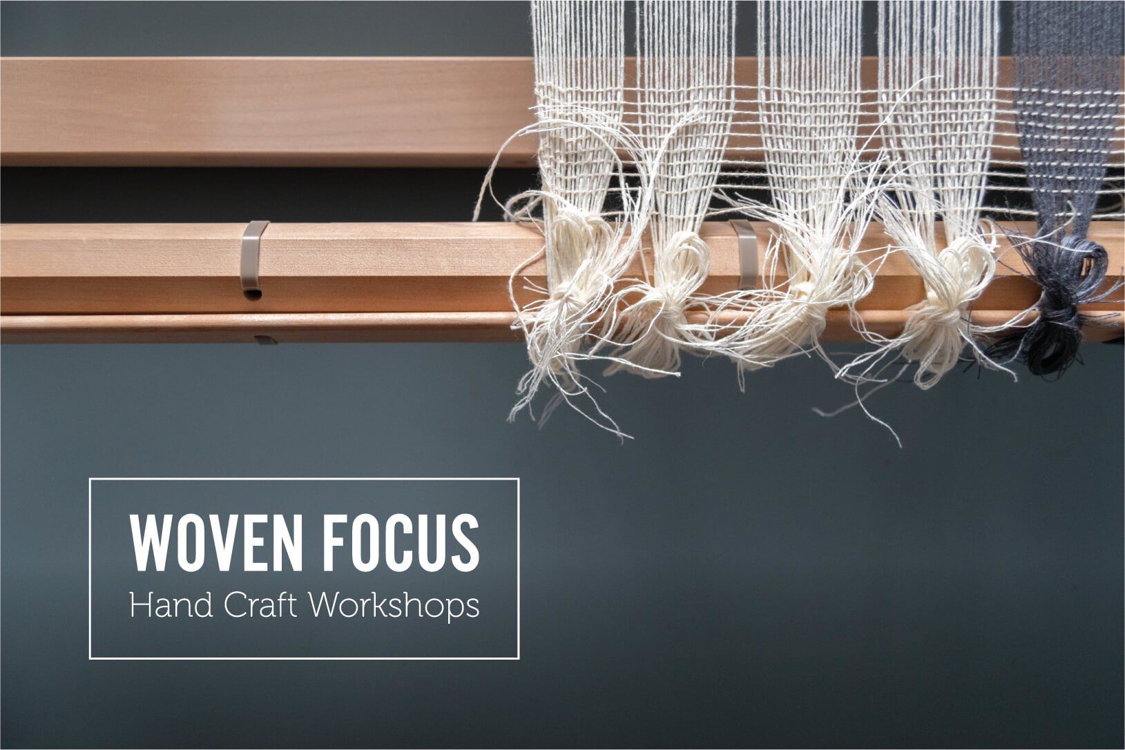

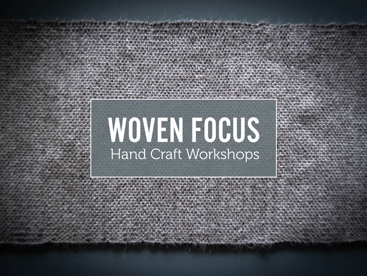
Woven Focus
BRAND STYLING • PHOTOGRAPHY • SCENE STYLING • LOOK BOOK BROCHURE • PRINTING
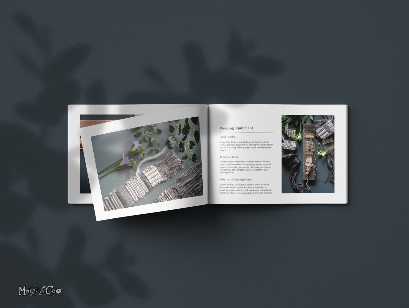
Jo's specialty is hand weaving, and her work is incredible! Woven Focus offers handcraft workshops, and has a creative studio based on the Isle of Wight. It's a super place to visit and learn a new hand craft skill, with an emphasis on client wellbeing and a powerful ethos of sustainable practice.
She wanted a look book style collection of her beautiful handmade creations. The beauty of these images lies within the skill that was captured by the camera, therefore the logo was to be simplistic, and subtly sit within the series of images.
"Michelle is a creative powerhouse. I am so pleased with the photography and logo for my website, Woven Focus. She really hit the brief ensuring the design process was collaborative, yet steered professionally with her expertise of the industry to refine the creative concept. Michelle is an absolute joy to work with and I can’t recommend her highly enough!"
Woven Focus


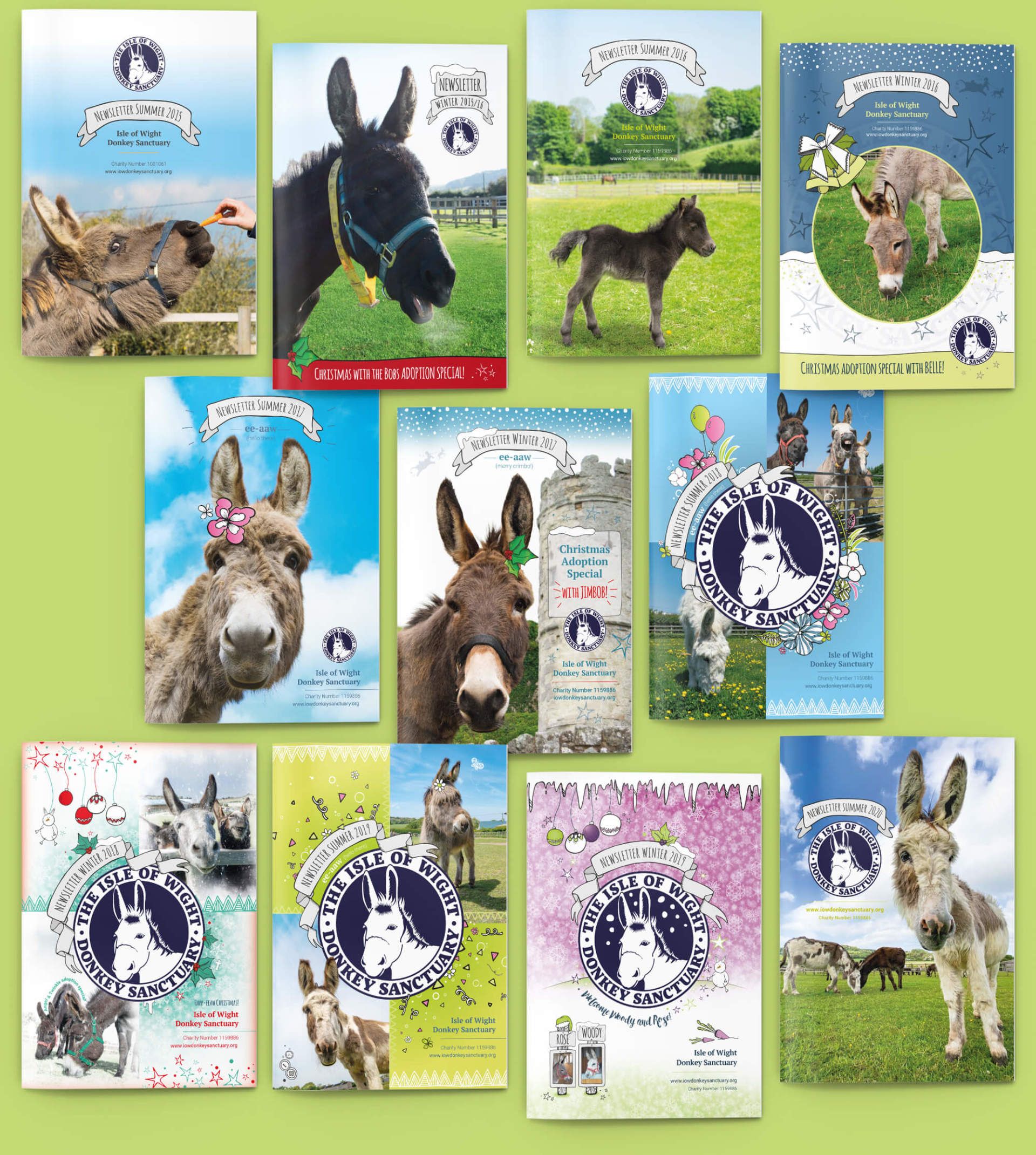
The Isle of Wight Donkey Sanctuary
MAGAZINE DESIGN • CATALOGUE DESIGN • PHOTOGRAPHY • CONTENT & COPYWRITER • BROCHURE LAYOUT • GRAPHIC DESIGN • ILLUSTRATION • PRINTING & DISTRIBUTION
2015 - 2022
Magazine Design
Twice a year, I created the a5 newsletter for the Isle of Wight Donkey Sanctuary. It's filled with hilarious stories, quirky photography and fun page compositions. The tone is shared between fun and serious, as the realism is that not all of these donkeys are in 100% health (although the Sanctuary works tirelessly to avoid these difficult situations).
The newsletters are fully managed and designed by myself, with copywriting and content contributions from Derek Needham, Charity Manager (his stories are absolute comedy gold!). To get your hands on one, simple adopt a donkey here!
Product and Gift Catalogue
At Christmas, there is also a gift catalogue that accompanies the newsletter. My studio allows me to offer product photography for their donkey gifts and merchandise (some of which I also provide), where I can shoot, edit, and then combine the elements into a printed catalogue.
"MooksGoo astounds us every time she creates our newsletter and catalogue. The originality and extraordinary creative flair from Michelle is just fantastic. She is personable, engaging and makes a real effort to understand not just the work that needs to be done, but also the ethos of any organisation she represents."
The Isle of Wight Donkey Sanctuary


Barcelona World Race
MAGAZINE DESIGN • BROCHURE LAYOUT • GRAPHIC DESIGN
This brochure was my very first paid freelance job! Oh the excitement when I was asked to join OC Sport - a sailing event management agency. It was my first taste of an industry environment, and I loved it (thank goodness!). I was the lead graphic designer for the visual elements and overall layout of the pages.
"We were thrilled by Michelle's optimistic attitude and very efficient design skills at such an early stage in her career."
OC Sports