
Graphic Design
Welcome to the graphic design department!
Here's a few samples of work I have been proud to be a part of...
Communication is everything. If something isn’t easy to use, navigate or understand, people won’t stick around – simple as that.
Graphic design is about creating clear, engaging experiences that inspire, inform and delight. It’s problem-solving with purpose, blending words, imagery and visual storytelling to communicate ideas beautifully and effectively.
Every project starts with understanding your audience, your goals and what sets you apart. Whether you’re aiming for more awareness, more engagement or more sales, thoughtful design helps people connect with your message and remember it.
At its best, graphic design makes people pause, feel something, and think “yes – this feels right.”
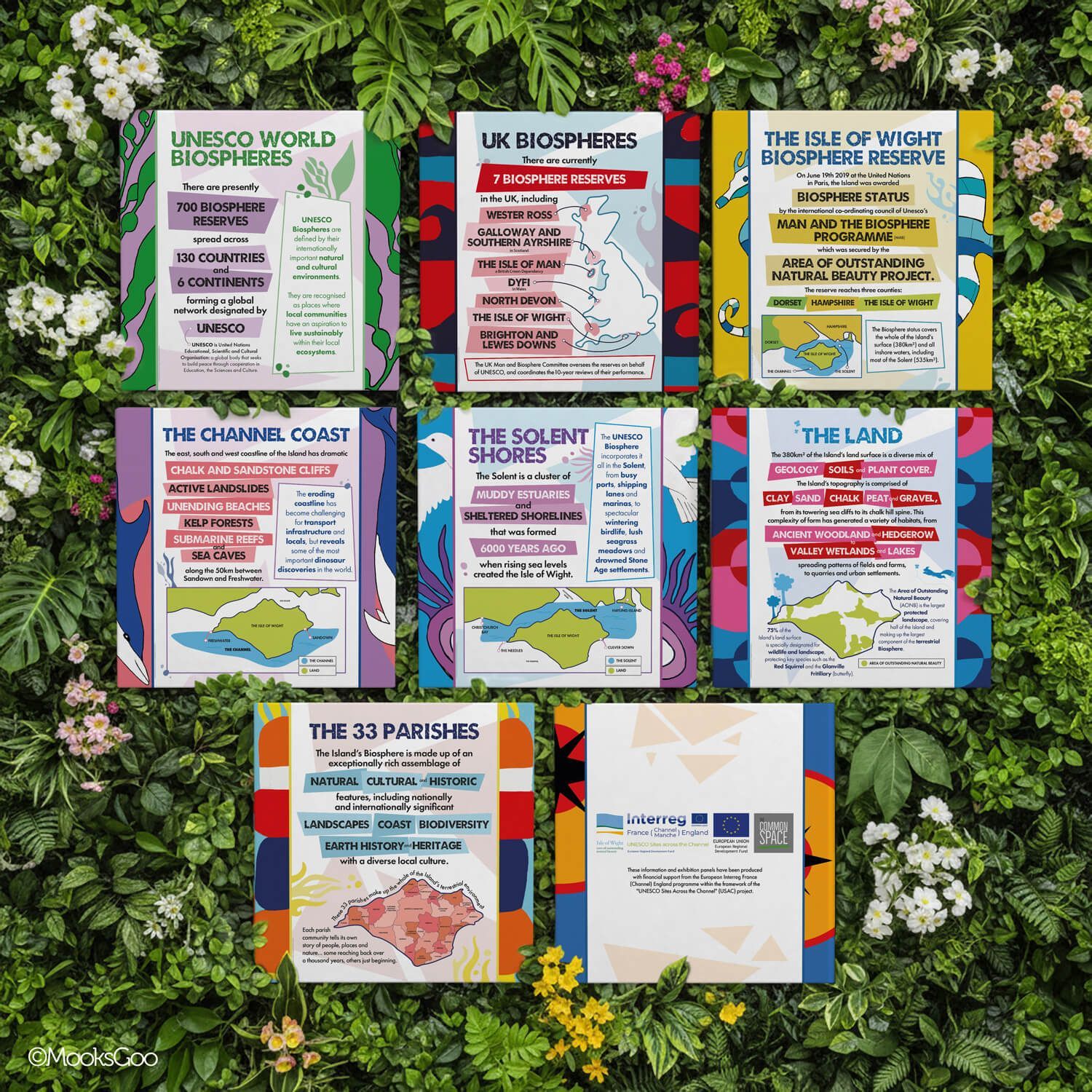
The Common Space
INTERPRETATION PANEL DESIGNS • PRINTING
Created to celebrate and communicate the Isle of Wight’s UNESCO Biosphere Reserve status, this series of interpretive panels uses bold typography, a clear hierarchy, and vibrant illustrations, turning complex information into clear, colourful stories that draw people in and spark curiosity.
"Thanks so much, Michelle, for these fantastic designs, the AONB (Area of Outstanding Natural Beauty) are really blown way by them!"
Ian Boyd, The Common Space.
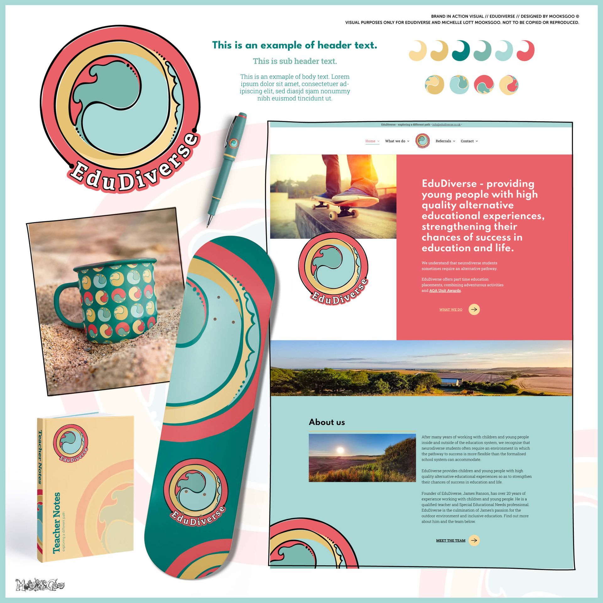
EduDiverse
LOGO • BRANDING • VISUAL IDENTITY • WEBSITE • INTEGRATED BOOKING SYSTEM
This vibrant, inclusive brand identity captures EduDiverse’s mission to provide alternative educational experiences that inspire growth and confidence for neurodiverse learners.
The design blends organic curves and soft circular motifs - inspired by the yin yang - to reflect balance, creativity, and support. The bold wave emblem symbolises resilience and forward motion, echoing the core values of education and learning. It also embraces the idea that 'it’s okay to colour outside the lines', because real learning happens through exploration, trial, and error.
A coastal-inspired palette of seafoam teal, coral, and sandy gold evokes calm, optimism, and connection to nature.
The website was built from the ground up, offering an integrated experience booking system for families and groups alongside the alternative education programme. It continues the brand’s inclusive ethos, delivering a seamless, user-friendly experience on every device.
"Michelle was fantastic - friendly, professional, and delivered a stunning logo and website that perfectly captured my vision. Highly recommend!"
James Ranson, EduDiverse.
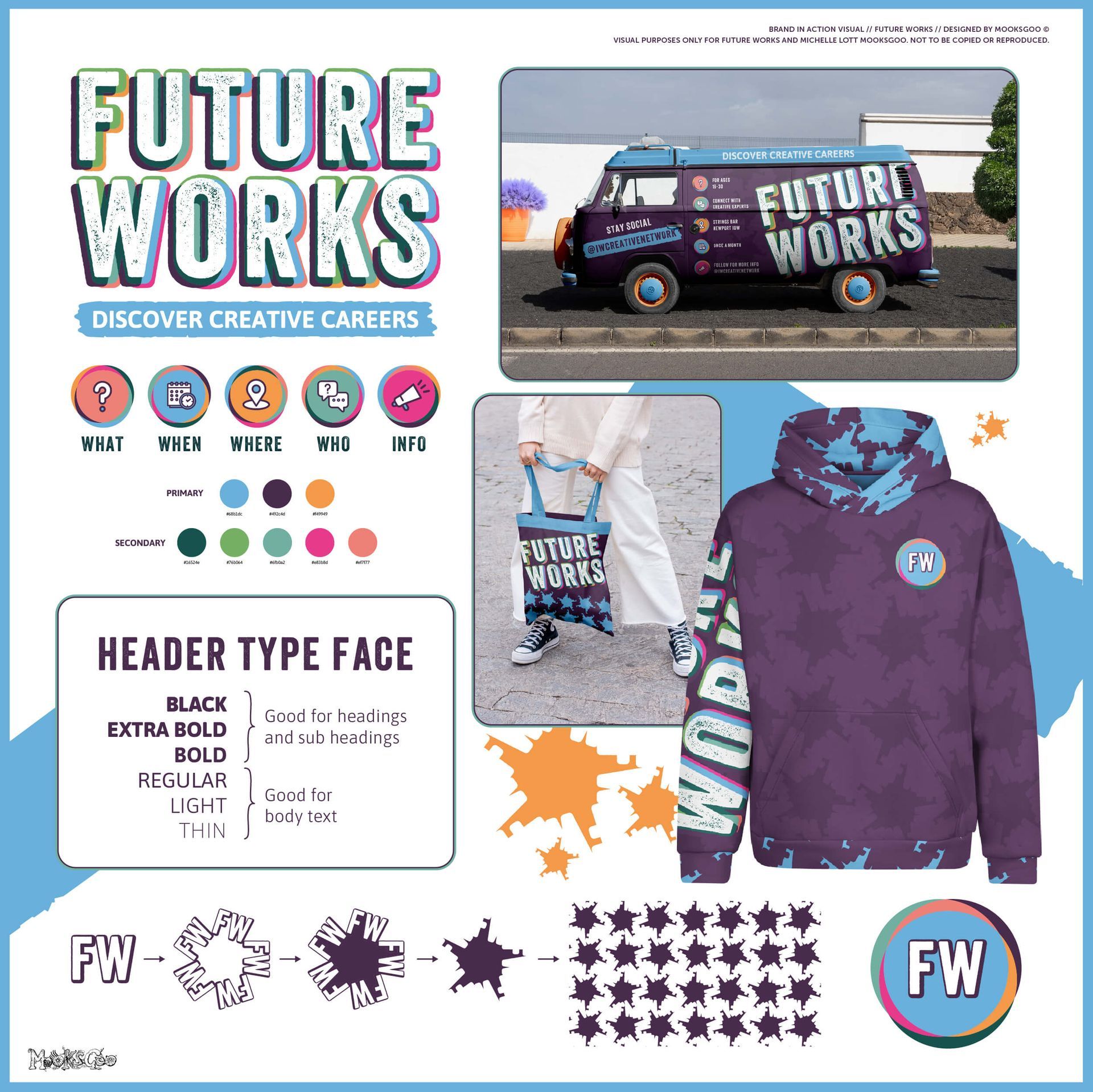
Future Works
LOGO • BRANDING • VISUAL IDENTITY
This bold, youth-focused identity captures the vibrant energy of Future Works - an event connecting 16–30-year-olds with creative careers on the Isle of Wight. The dynamic mix of electric purples, blues, and oranges - paired with bold typography and playful star motifs - reflects confidence, creativity, and collaboration.
The result is an eye-catching, contemporary brand that feels exciting, inclusive, and full of possibility, inspiring young people to connect, create, and explore their future in the arts.
"It has a contemporary, professional feel with a bit of edge - it's really great!"
Georgia Newman, Creative Island.
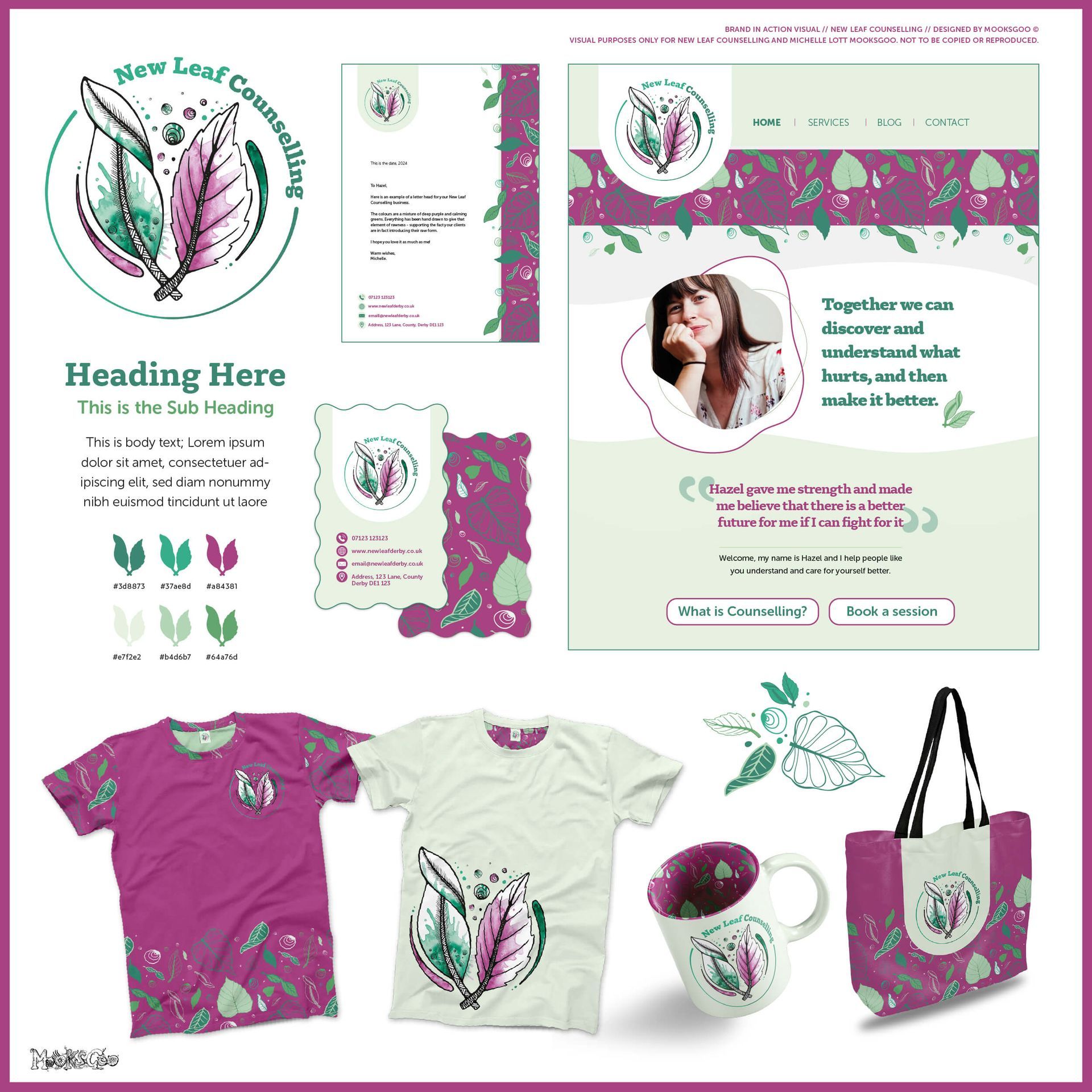
New Leaf Counselling
LOGO • BRANDING • VISUAL IDENTITY
This soothing, nature-inspired brand identity for New Leaf Counselling reflects growth, healing, and self-discovery. Soft organic shapes and a hand-illustrated leaf motif convey empathy and renewal, while a fresh palette of green, lilac, and magenta adds warmth and optimism.
The result is a gentle yet confident brand that feels approachable and uplifting, perfectly aligning with the values of compassion, trust, and positive change.
"You have done such wonderful work - I love it! Thank you."
New Leaf Counselling.
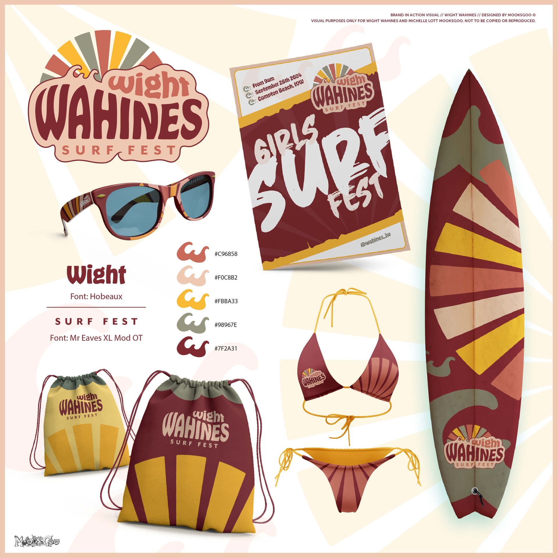
Wight Wahines
LOGO • BRANDING • VISUAL IDENTITY
This bold, sun-soaked identity channels the empowering spirit of Wight Wahines Surf Fest - a celebration of women, waves, and community. Inspired by retro surf culture, this visual identity combines warm sunset hues with dynamic curves that echo the island’s surf energy.
Playful typography and vintage-inspired graphics bring a nostalgic yet modern edge, while the cohesive look flows effortlessly across posters, boards, and apparel - creating a fun, fearless, and distinctly Isle of Wight brand.
"Thanks for the awesome logo MooksGoo!"
Wight Wahines.
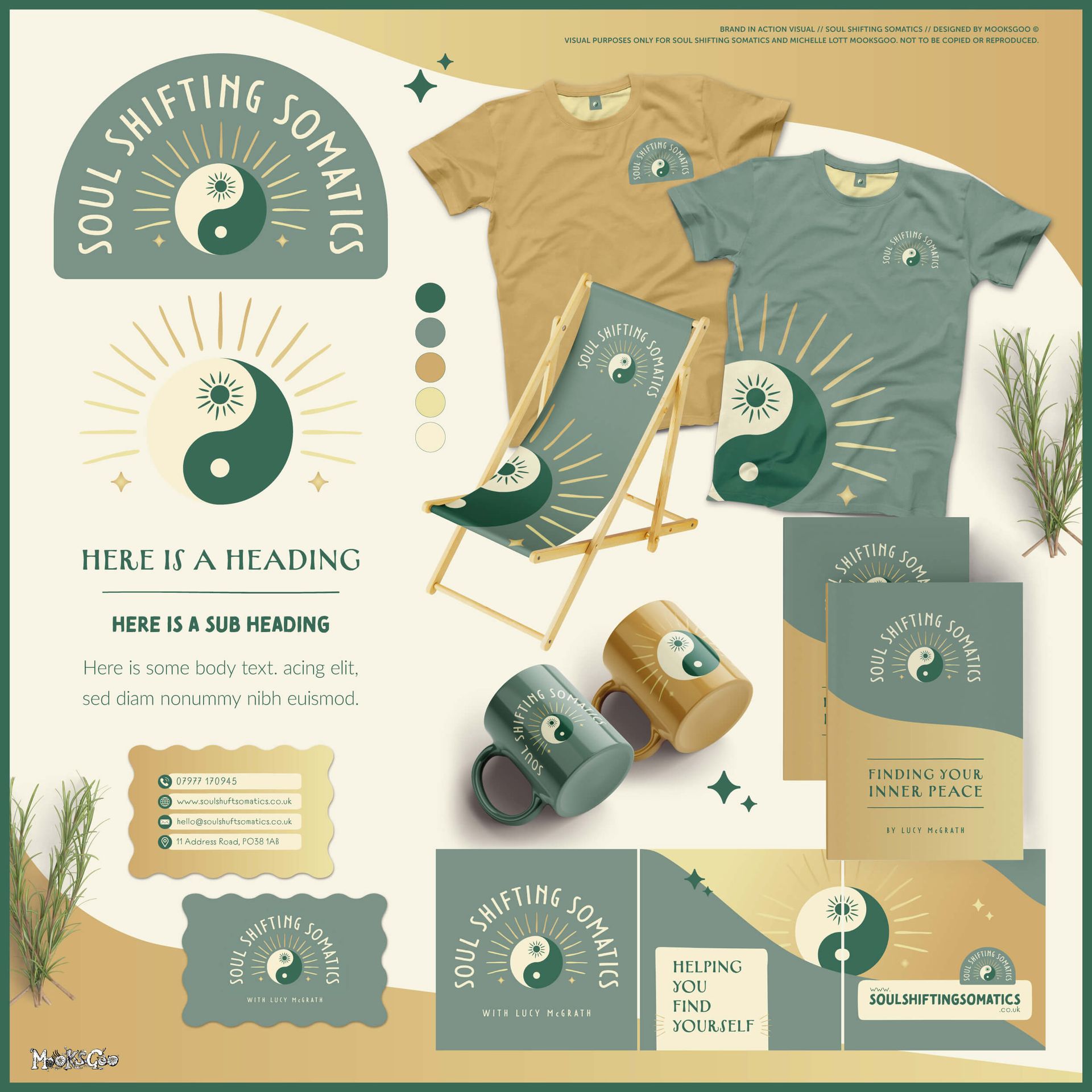
Soul Shifting Somatics
LOGO • BRANDING • VISUAL IDENTITY
Rooted in calm and connection, the Soul Shifting Somatics identity captures a journey toward balance and self-discovery. The yin-yang symbol and radiant sun express harmony, transformation, and inner awakening.
A soothing palette of sage, ochre, gold and cream grounds the design in warmth and mindfulness, while clean typography and gentle curves create a sense of flow and ease - perfectly aligned with holistic wellbeing and personal growth.
"Honestly, I am blown away! It's so improved on what I was thinking. This is really so exciting, huge gratitude!"
Soul Shifting Somatics.

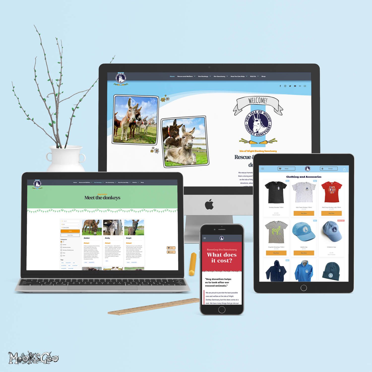

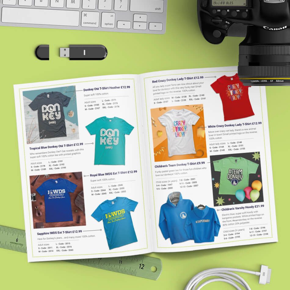
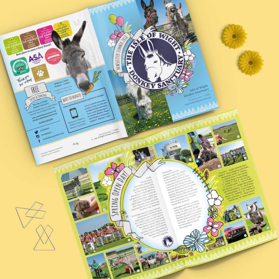

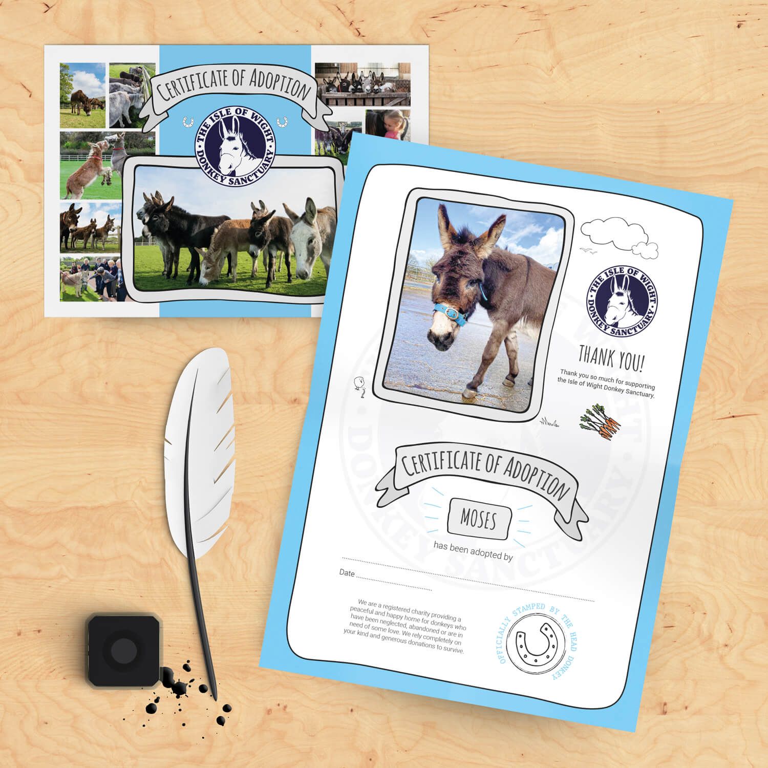
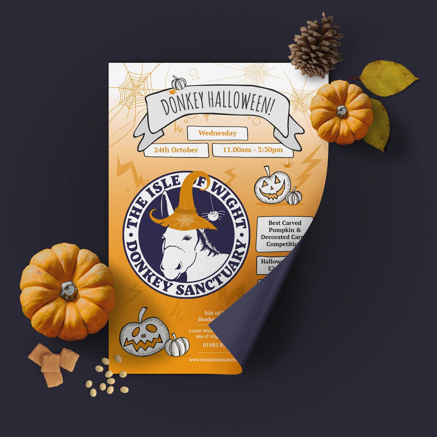


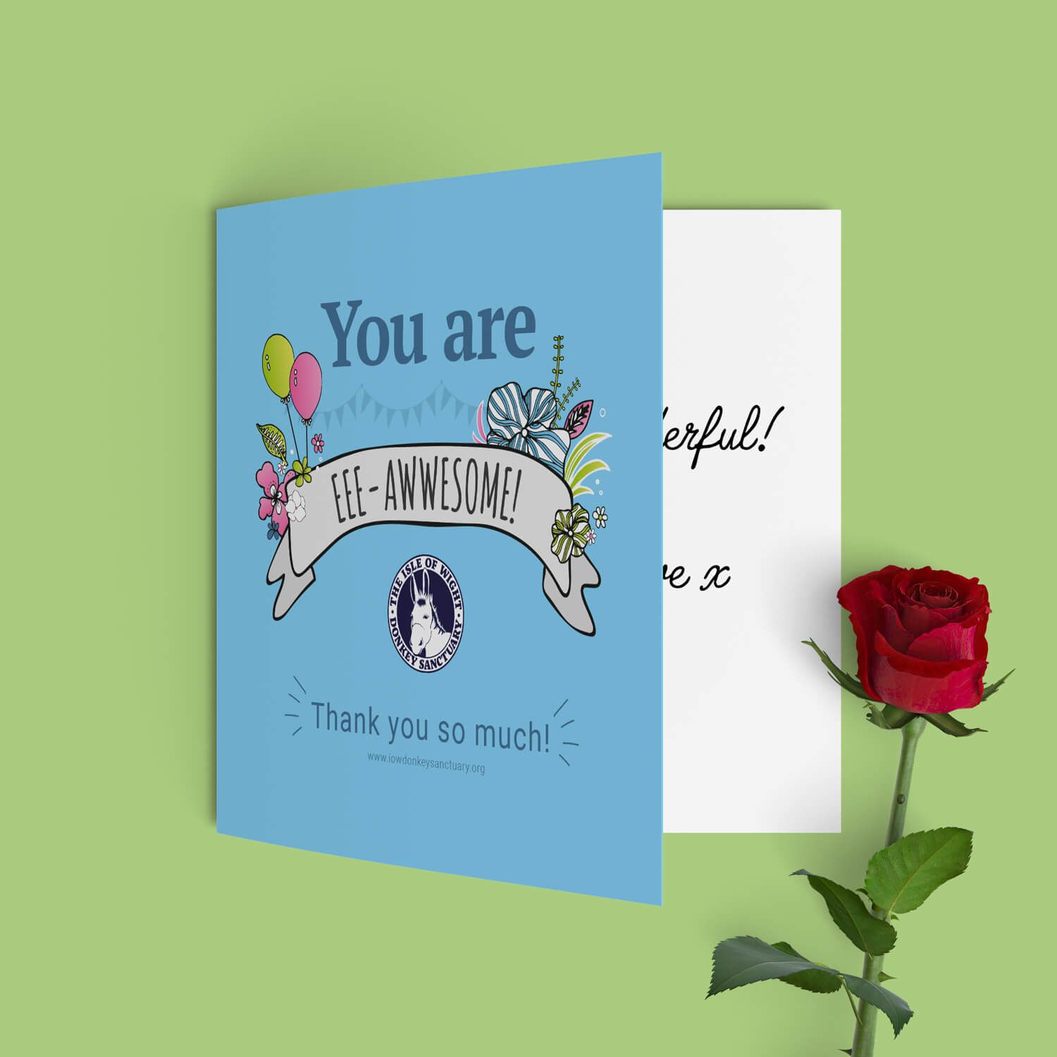


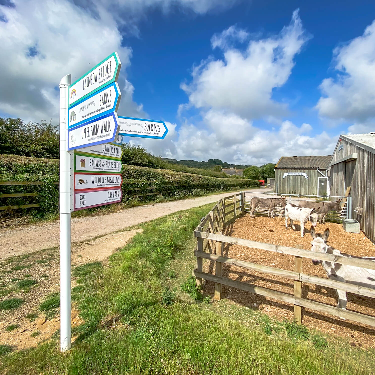


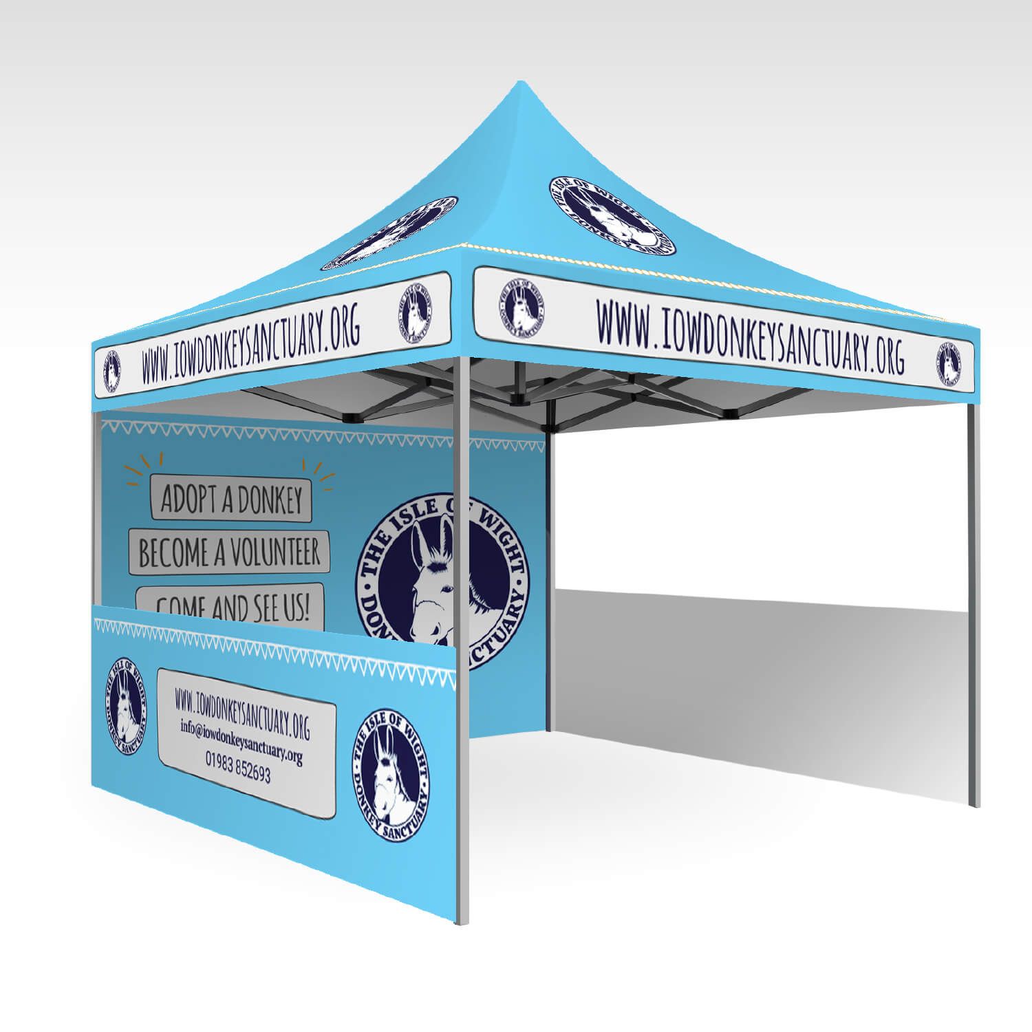
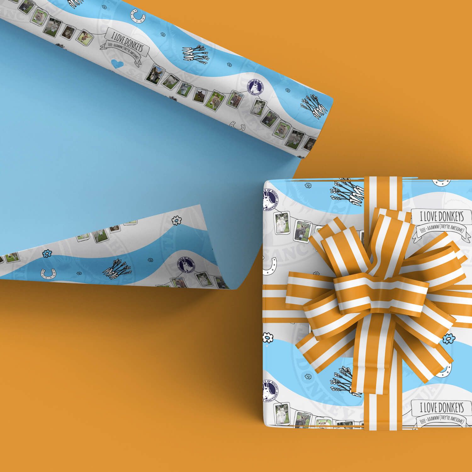


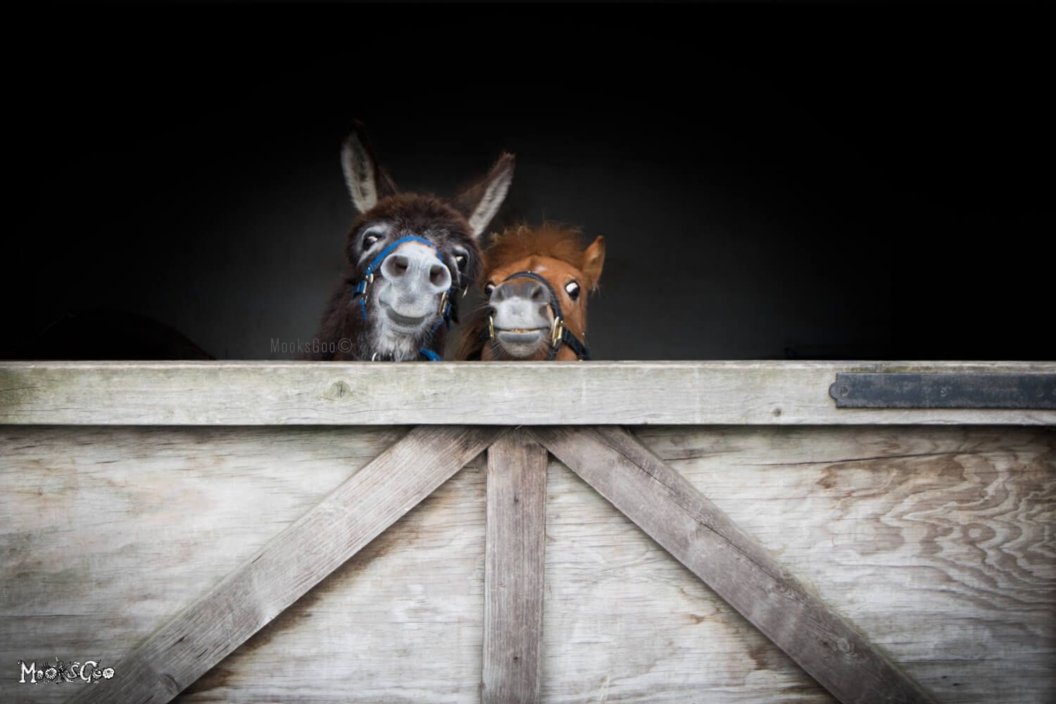
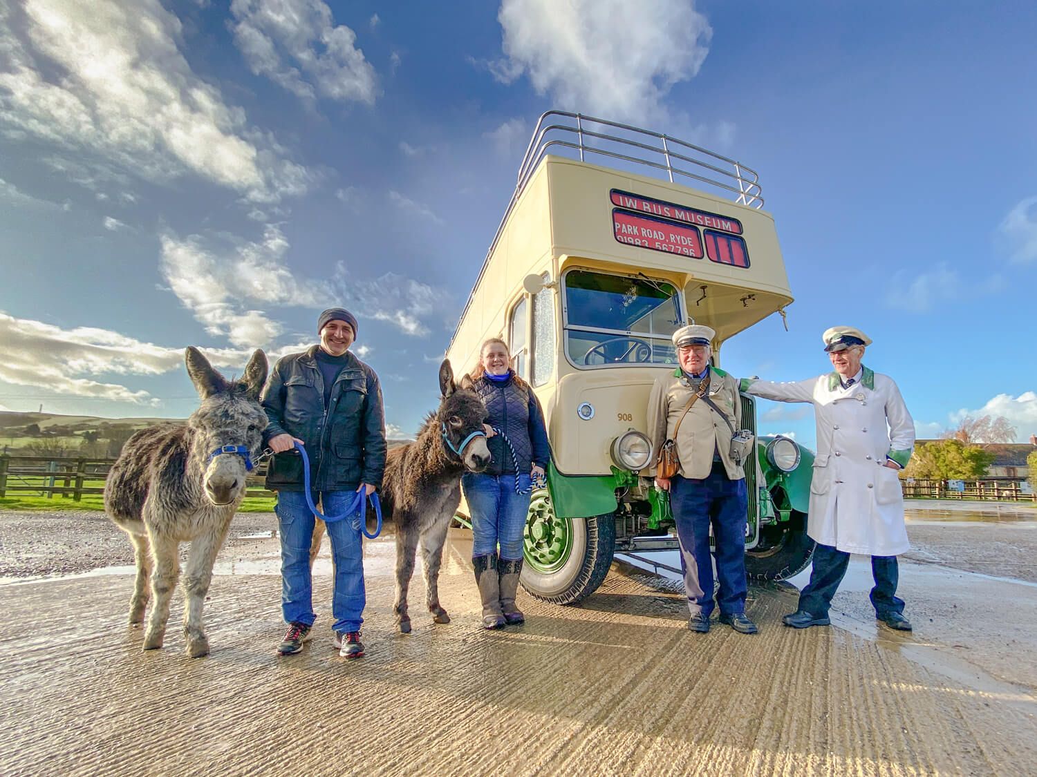

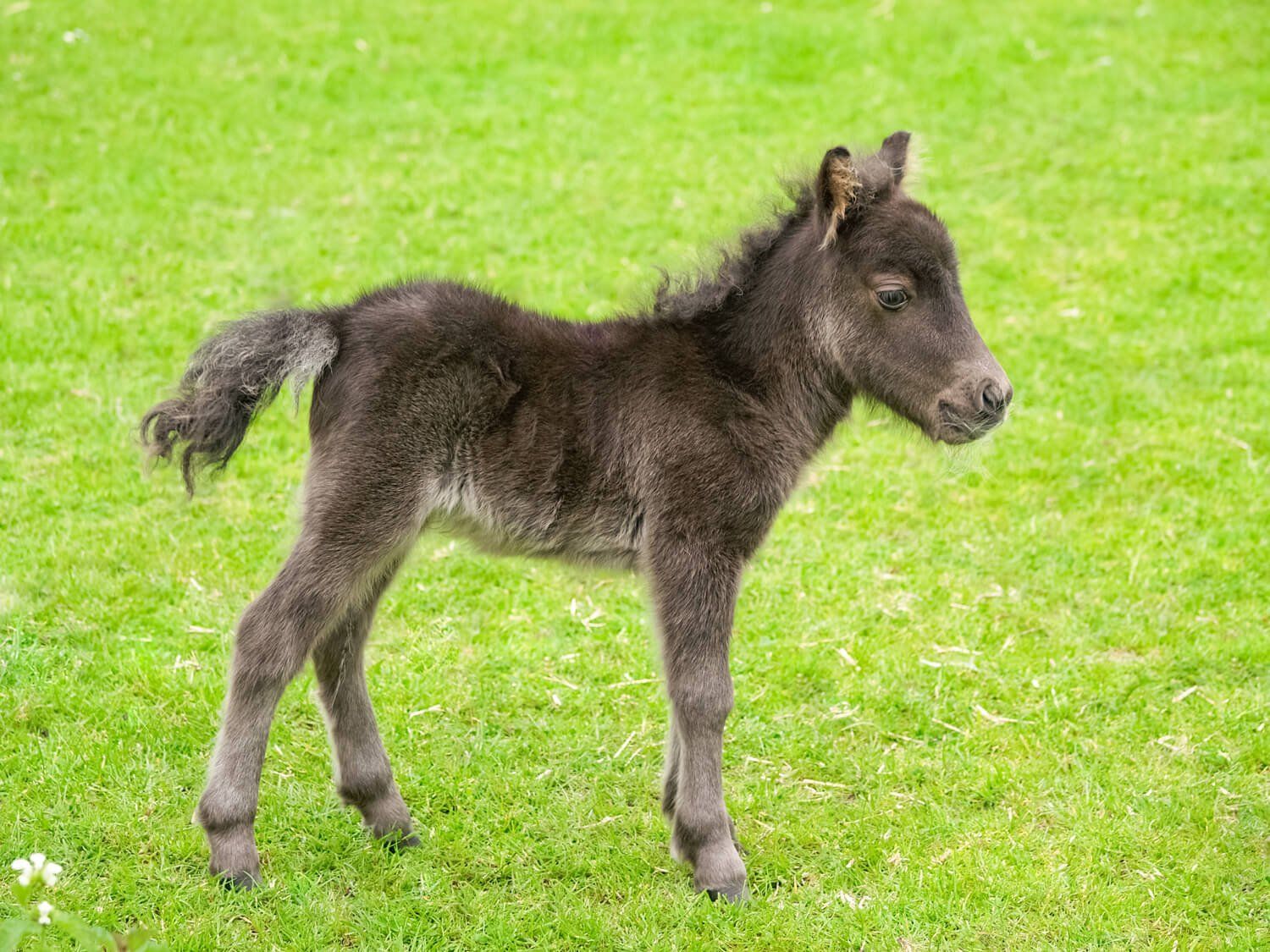
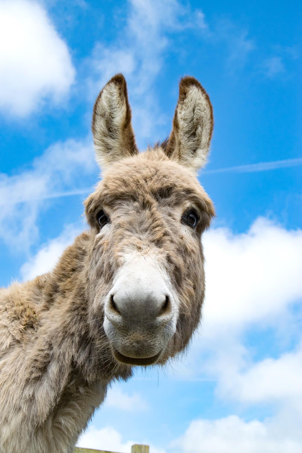


The Isle of Wight Donkey Sanctuary
Logo Refresh • Branding • Website • Graphic Design • Marketing • Biannual Newsletter • Copywriting • Photography • Catalogue • Illustration • Printing • Signage • Shop Products • Fundraising Strategies
The IOW Donkey Sanctuary is close to my heart, as I often visited and supported them whilst growing up (I have vague memories of being chased by a chicken...).
From 2015 to 2022, I worked closely with the Sanctuary team as their lead graphic designer, managing and delivering the majority of their design projects across print and digital. During this time, the charity underwent a remarkable transformation, growing from the brink of bankruptcy into a thriving, much-loved organisation, exceeding expectations year after year.
The visual identity I developed used bright colours, hand-illustrated elements and joyful photography to create a brand that stood apart from traditional animal charities. Rather than relying on emotional or distressing imagery, the focus was on celebration - highlighting the donkeys’ personalities and the happy, safe lives they now enjoy. The result is a warm, optimistic brand that reflects the Sanctuary’s values and invites people to connect through positivity and hope.
"Michelle is original, diligent and has extraordinary flair. She embeds herself in projects and really goes above and beyond the work that she undertakes. She is personable, engaging and makes a real effort to understand not just the work that needs to be done, but also the ethos of any organisation she represents."
The Isle of Wight Donkey Sanctuary


The Common Space
ILLUSTRATION • EXHIBITION DISPLAY PANELS • SIGNAGE • PRINTING
Large Exhibition Panels
A series of 6, 1 metre panels that were displayed at the Futurebuild exhibition, London, for the company Arc. This was a collaboration for the good of the world, something which I am extremely passionate about! Each panel represents a different topic, which Arc specialises in.
There are hand drawn illustrations for each theme - places, people, biodiversity, climate and performance. Arc really are an amazing team; it's a pleasure to work with them on many of their exciting projects!
"You've brought our visions together Michelle - just so clever! Thanks so much for all your excellent hard work!"
Claire Hector, The Common Space.

Isle of Wight Hockey Club
SPORTS LOGO DESIGN • HOCKEY SHIRT MOCKUP
The colour combination of bright orange and a deep inky blue exerts power and enthusiasm - perfect for a sports team. In the centre of the logo, the Isle of Wight shape has a hockey stick (instead of the normal River Medina), with a sequence of 'hockey balls'. These balls are increasing in size, depicting the growth and success of the team.
The circles encompassing the logo suggests a team, working wholly as one unit. The bold serif font is strong and aligned - similar to their team spirit!
"We’re very happy with the end result and I particularly like the way the River Medina has been shaped like a hockey stick - very clever. We want to thank MooksGoo for her hard work!"
Isle of Wight Hockey Team
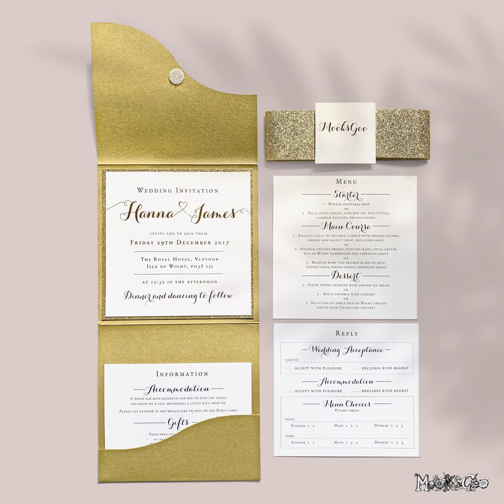

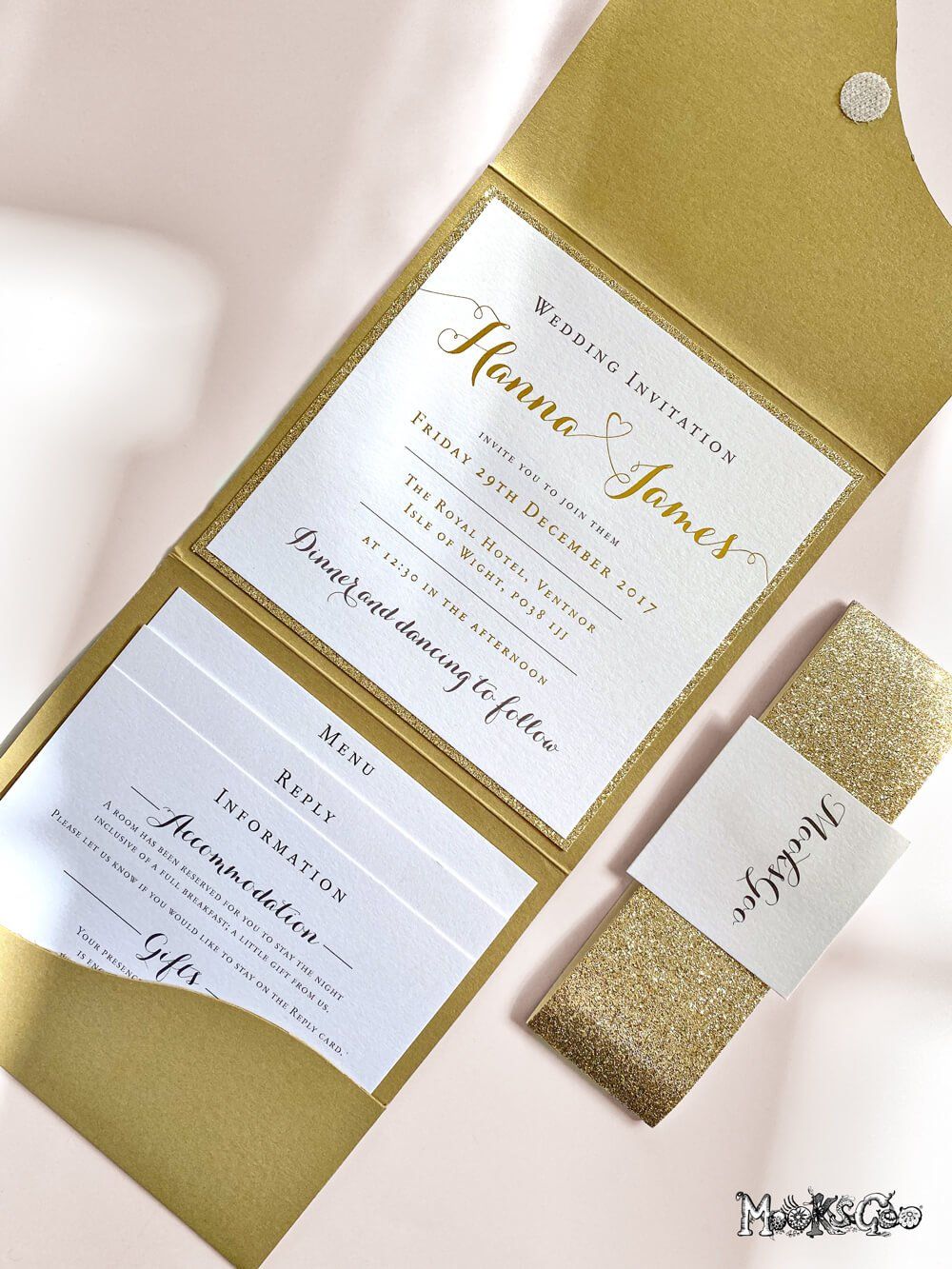
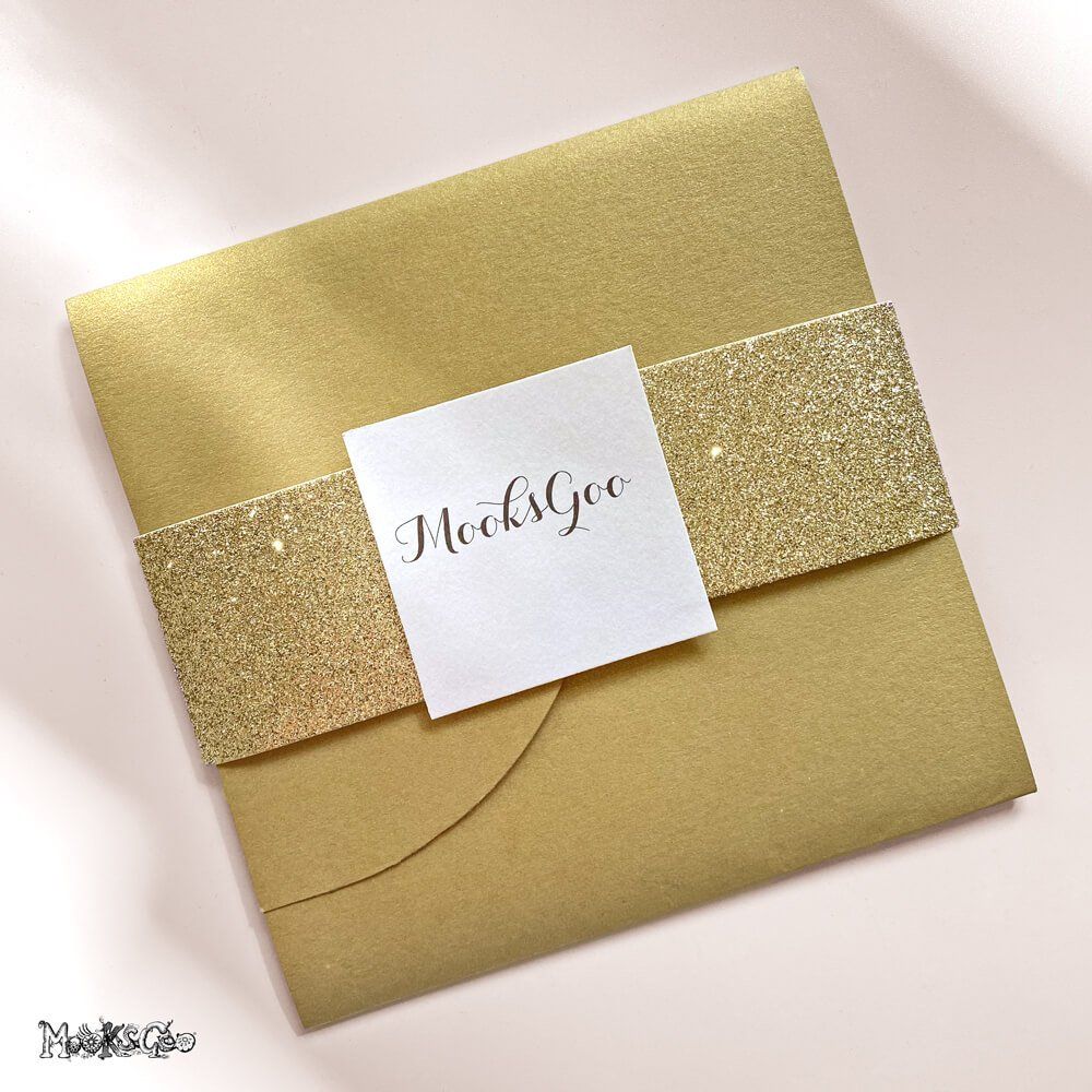
Wedding Invitation
BESPOKE NESTED INVITATION, MENU AND RSVP CARD • FOLDED ENVELOPE • PRINTING GOLD FOIL • TEXTURED PEARL STOCK • GOLD GLITTER
This luxurious wedding invitation was an exciting experience for the guest, as the envelope housed the venue information, the menu and the RSVP card. The gold embossed foil and gold glitter background added depth and tactility. One would say it is rather lavish, darling.
"These are the most beautiful wedding invitations we've ever seen. Our guests were absolutely blown away with them!"
Mr and Mrs London.
